Unprecedented. Extreme. Sobering. It has been hard to keep pace with what’s happened in markets this year. Here, Dynamic Planner’s Head of Investment Services Jim Henning takes a step back from the headlines and highlights the immediate and longer-term trends and shifts witnessed in 2020.
How does this year’s volatility compare in the context of the last 20 years? Which asset classes have been the biggest winners and losers in the first half of 2020? And how have the benchmark asset allocations, representing Dynamic Planner’s 1-10 risk profiles, stood up to all this?
- Not currently a Dynamic Planner user? Get in touch and find out how we can help
Individual asset classes
None of us escaped the headlines earlier this year detailing dramatic drops of more than 20% in major financial markets, which of course has been a concern for advice firms and for their clients. Looking beyond that, clients’ investment portfolios by and large are well diversified. So how have individual asset classes performed this year against such a volatile backdrop?
Considering this through first the lens of an equity investor and then a bond investor can perhaps put this into greater perspective.
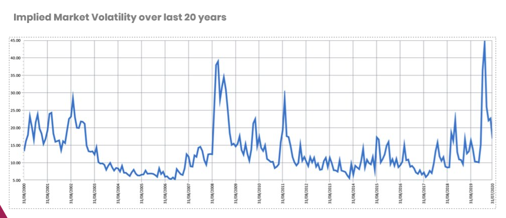
The graph below shows what is called the ‘fear index’, implied market volatility historically over the last 20 years. In this context, it is sobering to see the scale of what we’ve experienced this year as a result of the pandemic. That is what equity markets have had to address, while the story has been similarly brutal for bonds.
We can see below bond yields this year and where we have circled March, when we witnessed the most dramatic market downturns due to Covid-19. First, they plummeted. Then, they jumped back up. Then, they have fallen again. And these are huge shifts.
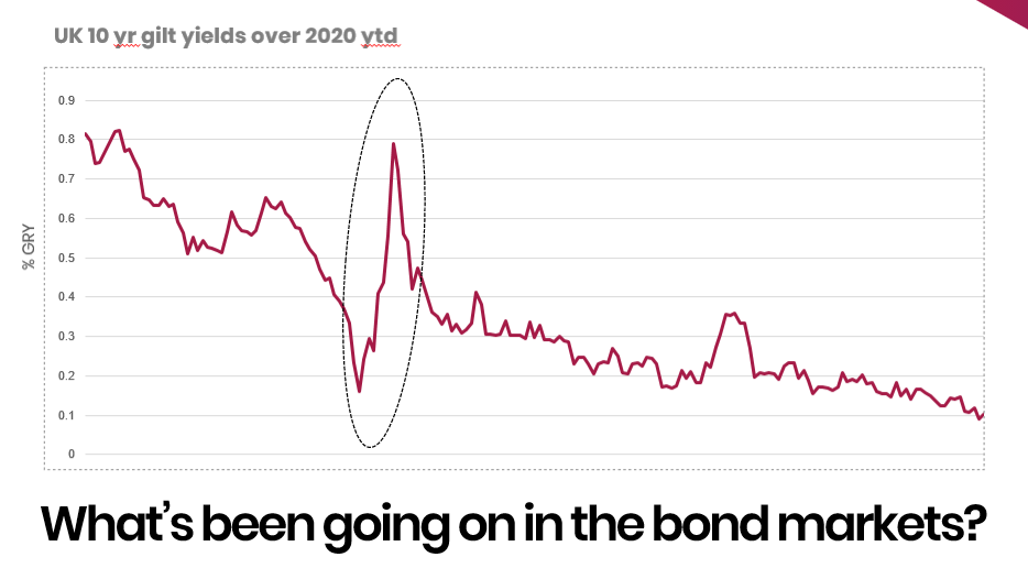
Things thankfully have settled down somewhat since, but we can see an inexorable trend of UK 10-year gilt yields falling to just 0.1%, which is unprecedented in scale and is driven by the massive financial stimulus we’ve seen globally here and from other central banks in response to the pandemic.
Here in the UK, it is forecast that the Bank of England – in terms of issuance and showcasing the scale of QE, quantitative easing – will own approximately one-third of the UK gilt market and around £2 trillion of debt in issuance. Quite sobering. We have never seen anything like this.
It’s interesting if we look at how all that has manifested itself, in terms of core asset class performance in H1 2020, as we see below.
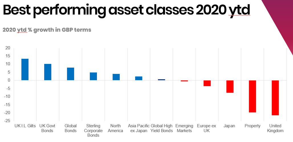
On the left-hand side, we can see a dichotomy in that UK index linked gilts were the best performing asset class followed by UK gilts or government bonds. Meanwhile on the opposite, right-hand side of the graph, we can see the travails of equities markets and the UK, in particular, which has very much been the pariah here this year, given the gloomy outlook for the UK economy and dare we mention it, Brexit uncertainty which continues as I write. Ditto here, UK property, which too has had a torrid time.
How have the Dynamic Planner asset allocations fared?
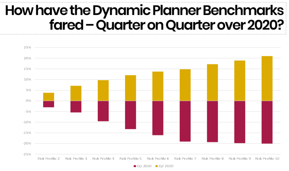
Moving away from that, how have the 1-10 Dynamic Planner benchmark asset allocations performed and stood up to these pressures in H1 2020?
We can see below in the claret bars the returns and losses experienced in Q1 this year before, in the gold bars, the strong recovery we enjoyed in Q2. In short, most losses had been recouped, which is comforting to see.
Another way we can consider this is by looking in greater detail at the returns you would expect from a diversified portfolio. For example, below left shows the performance of the benchmark asset allocation for a Dynamic Planner Risk Profile 5 over 18 months from January 2019 to July 2020, with the blue line trajectory showing expected returns we forecasted over this period back in January 2019. We can see the returns, as of July 2020, actually exceeded expectations.
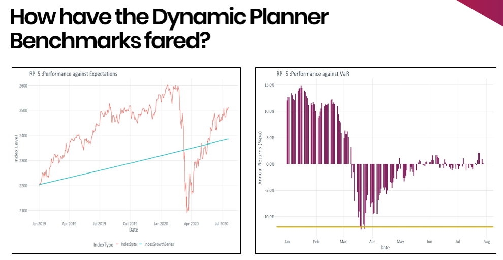
Above right we can see our Value at Risk measure in H1 2020, showing what we would expect with a 95% confidence. Given the torrid time markets have had, it’s been encouraging to see our Asset Risk Model perform largely in line with expectations.
To put this further into context, below left we can see actual observed volatility across our 1-10 benchmark asset allocations in red, since launch in 2005 and in gold, since 2015 in the last five years, where we can happily see that symmetry and relationship between risk and reward, which has again been largely consistent over these periods.
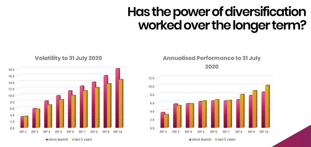
Above to the right, what we see is more challenging. Of course, as we have repeated, we have been in unprecedented times, with untold helicopter money pouring into risk assets and that has undoubtedly impacted at the lower end of our 1-10 risk scale.
There is a flattening towards the centre of the scale of performance of the benchmark asset allocations over the last 12 months, which perhaps is not what we would have expected, but given that environment, hopefully it is still apparent that there is a long-term trend of being rewarded for taking extra risk. Of course, that is clearly becoming more challenging and that is across the board for multi asset investment portfolios today.
Find out more about how you can research funds for your clients in Dynamic Planner.


